Aligning labels and textboxes in a form can be a challenging task, especially when dealing with varying label lengths and input widths. However, with Flexbox, achieving a consistent and responsive layout becomes a breeze. In this tutorial, we’ll explore how to use Flexbox to align labels and textboxes in a Blazor form, but the principles apply to standard HTML forms as well.
The Problem
By default, HTML forms can be cumbersome to style, especially when trying to align labels and textboxes. The traditional approach involves using tables or floating elements, which can lead to inflexible and brittle layouts. Consider the following registration form coded in Blazor:
<EditForm Model="@userModel" OnValidSubmit="HandleValidSubmit">
    <div class="form-group">
        <label for="ssn">SSN</label>
        <InputText id="ssn" class="form-control" @bind-Value="userModel.SocialSecurityNumber" />
    </div>

    <div class="form-group">
        <label for="name">Name</label>
        <InputText id="name" class="form-control" @bind-Value="userModel.Name"/>
    </div>

    <div class="form-group">
        <label for="email">Email Address</label>
        <InputText id="email" class="form-control" @bind-Value="userModel.EmailAddress"/>
    </div>

    <button type="submit" class="btn btn-primary">Submit</button>
</EditForm>
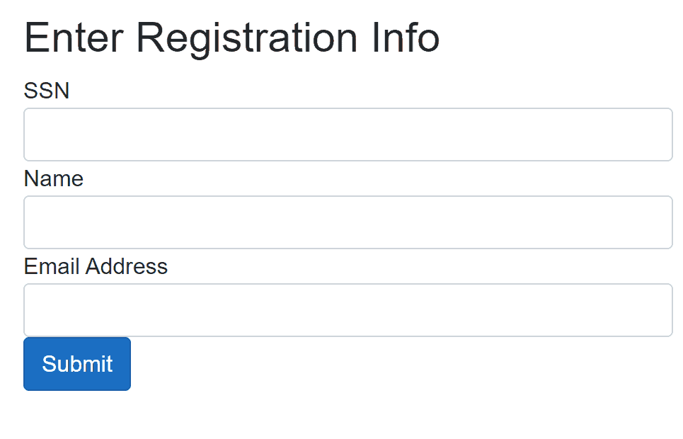
which, without styling, looks like this:

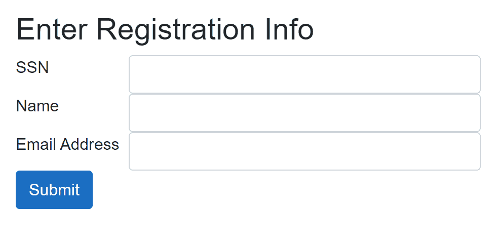
What we want is to put the labels in one column, and the text boxes in another column, something like this:

The Solution
Flexbox provides a simple and efficient solution to this problem. By applying Flexbox properties to the form groups, we can easily align labels and textboxes. The CSS below will accomplish the job.
.form-group {
    display: flex;
}

.form-group label {
    flex: 1 1 150px; /* Equivalent to:
                        flex-grow: 1;
                        flex-shrink: 1;
                        flex-basis: 150px; */
    text-wrap: nowrap;
}

.form-group input {
    flex: 1 1 0; /* Equivalent to:
                    flex-grow: 1;
                    flex-shrink: 1;
                    flex-basis: 0px; */
}
How it works
- In our html form(EditForm above), we wrap each label and input pair in a
divwith the classform-group. - We set
display: flexon the.form-groupelements to enable Flexbox layout. - For the labels, we use
flex: 1 1 150px, which means:flex-grow: 1: Take up equal space.flex-shrink: 1: Shrink equally if necessary.flex-basis: 150px: Start with a width of 150px, enough for the longest text which is “Email Address“
- For the inputs, we use
flex: 1 1 0, which means:flex-grow: 1: Take up equal space.flex-shrink: 1: Shrink equally if necessary.flex-basis: 0px: Start with no width and expand to fill available space.
Note: flex-grow:0 or flex-shrink:0 means the space will not move no matter how you resize the browser! I use flex-grow:1 and flex-shrink:1 so that when you resize the browser, the space will move as long as it’s within the flex-basis value.
Conclusion
With Flexbox, aligning labels and textboxes in forms becomes a straightforward task. By applying simple CSS rules, you can create responsive, maintainable, and visually appealing forms. This technique can be applied to standard HTML forms as well, making it a valuable tool for any web developer.
